the making of T travel times
20 December 2019, but only if we're using Hawaiian time
In Thailand I lived right by a metro station, or a BTS station as we call it. Taking the BTS was a mindless activity——wherever the destination, I would just take the train at the station in front of my home.
Coming to MIT, I expected it would be the same. After all there’s a T station called ‘Kendall/MIT’, so it would make sense if that’s the go-to station. I couldn't have been more wrong.
First, there are two main ‘squares’ around campus: Central Square and Kendall Square. Each has its own selection of stores and restaurants, and also more importantly, its own Red Line station. This already means there are two stations to choose from.
The idea that would become T travel times was based on a map I saw on the MITAdmissions blog which showed, for each part of campus, whether going to Kendall or Central was the better idea. Unfortunately I couldn’t find that map anymore though, else I would have linked it here——perhaps it’s lost somewhere when MITAdmissions revamped their website.
One day, based on a combination of frequent Nud Pob trips (nice Thai restaurant!) and me browsing around Google Maps as usual, I saw that the Green Line, especially the BU West station, seems almost closer than Kendall or Central. For fun, I decided to measure the distance (in Google Maps) from my dorm, MacGregor House, to several stations that seemed nearby, and sent the results to a few friends.
“here is the list of five closest subway stations to MacGregor House (Amherst Alley side)
the distances are walking distances, measured using Google Maps' measure tool using satellite imagery and takes into account walking paths and road crossings
oh and these distances are to the closest entrance
1.55km Kendall
1.60km BU West
1.65km Central
1.69km BU Central
1.81km Hynes Convention Center
i'd estimate the error bar to be around +-0.02km for each of the stations”
This is pretty neat——there are five stations or so pretty much the same distance from MacGregor! Five is much more than one back home in Bangkok!
After that, the bulk of the semester came, and I promptly forgot about this neat fact… until a few days ago when I was brainstorming ideas for this winterbreak project, and I thought, why not do something based on this?
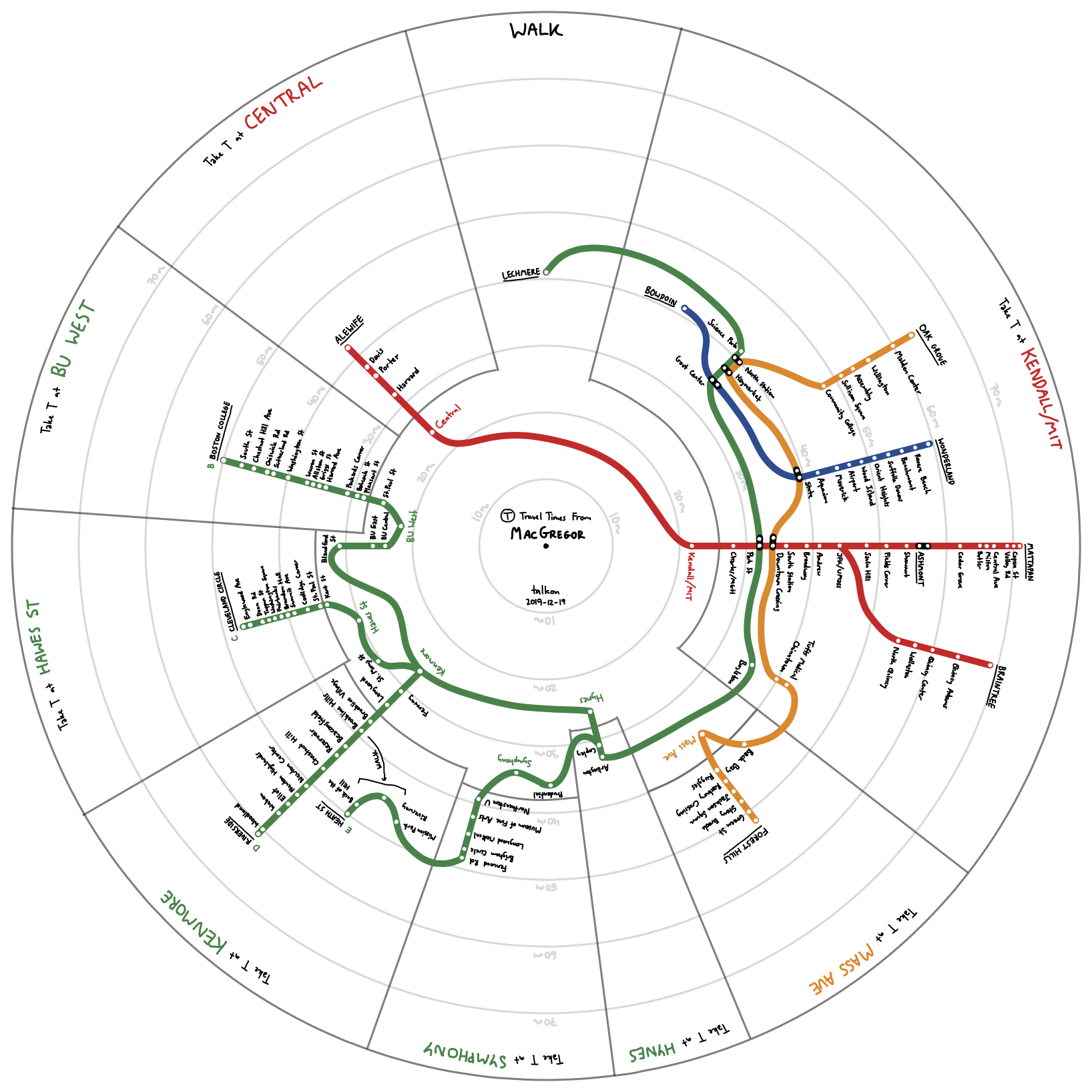
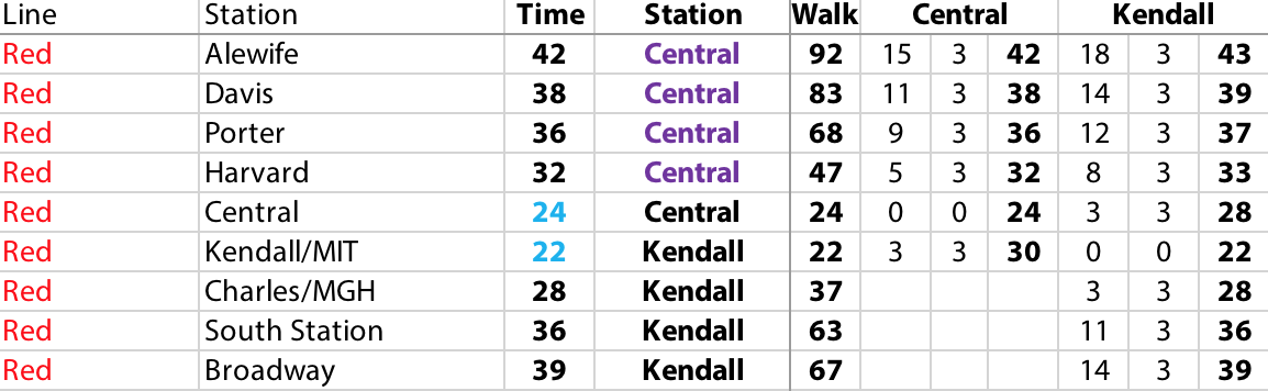
I thought it would be cool to see how long it takes to travel from MacGregor to each T station as well as what the optimal way for each station is, and so I started researching (a fancy word for “repeatedly searching for transit directions”). I decided to use Apple Maps over both Google Maps and MBTA’s own trip planner because I’ve found Apple Maps to be better at transit when they actually have the data, and MBTA’s times are simply too optimistic. To be more accurate I also added the expected waiting time, equal to half the period of each train line, to the times for taking the T. To be sure, I also compared it to walking times and times from different starting stations. The collected data was kept in a plain old Excel spreadsheet.
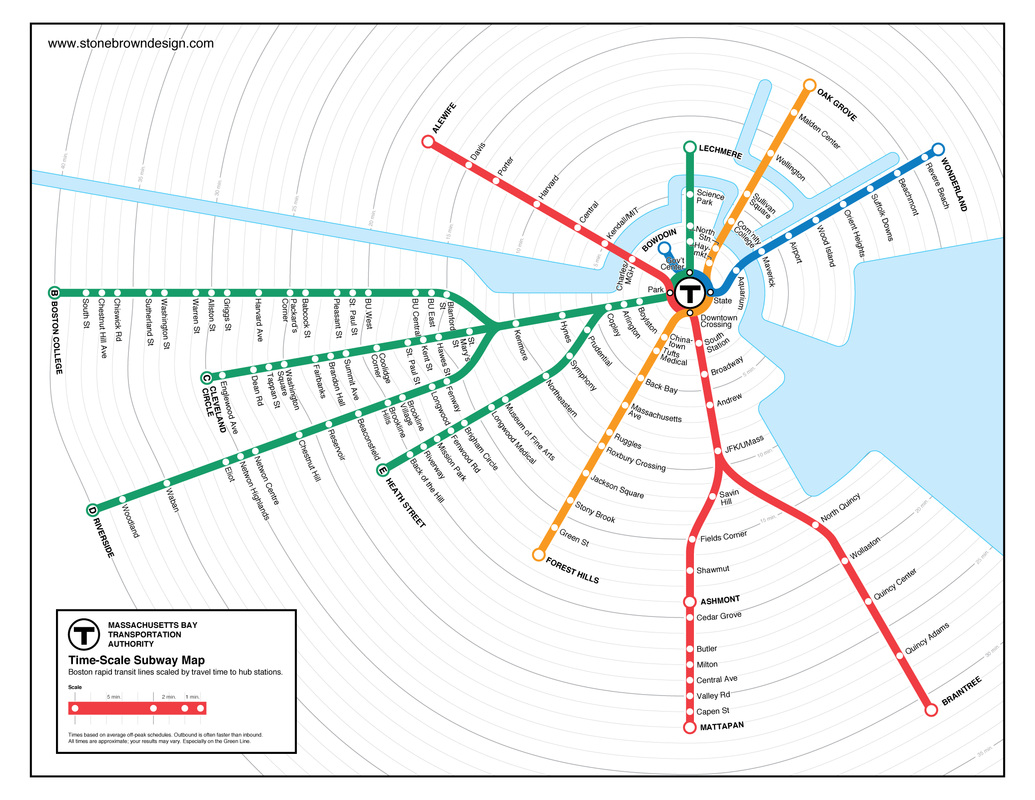
After collecting the data came the question of how to best visualize it. This turns out to be pretty hard! It’s not easy to somehow show both the times and the optimal station to walk to at the same time. My first idea was to simply overlay on the official T system map, listing times and color-coding for the optimal station, but then the colors would conflict with the lines, and it would be confusing. To kill time and look for inspiration I browsed a bunch of T system maps, and I stumbled upon this nice radial map of T times from the downtown stations, by Stonebrown Design. Source
This felt like the right idea, so I started drafting! I thought of using Adobe Illustrator for a short while, but as (i) I don’t own Illustrator, and (ii) it’s probably easier to hand-draw, I decided to hand-draw. My app of choice was Concepts, which supports vector graphics, and has infinite canvas——what’s not to like? The draft came out looking like this:
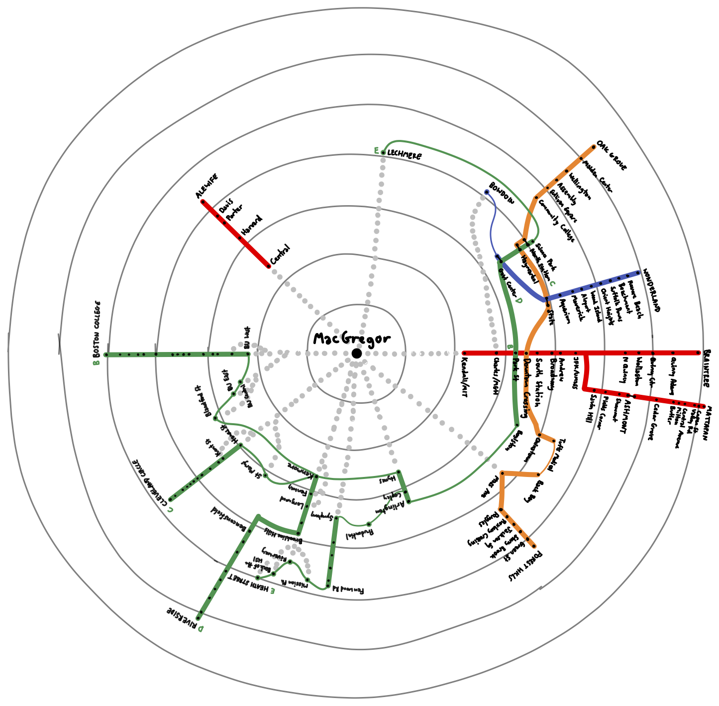
As is evident, this is already pretty close to the final version. Based on the draft, I decided that dotted lines is a bad way of showing which station is the optimal one to board the T, and that the flow of the lines need to be reworked a bit. For the real deal, I used the circular guide features (which I just discovered after finishing the draft) and my setup looked like this:
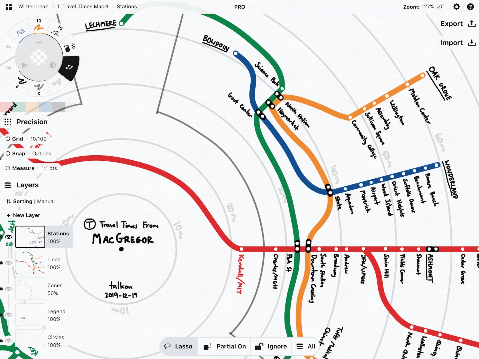
Drawing and revising the final version took a lot of time, but in the end I’m definitely happy with the product. Again, here's the link to see it in full vector graphics glory: Hi-Res (PDF, 628KB)